 EN
EN

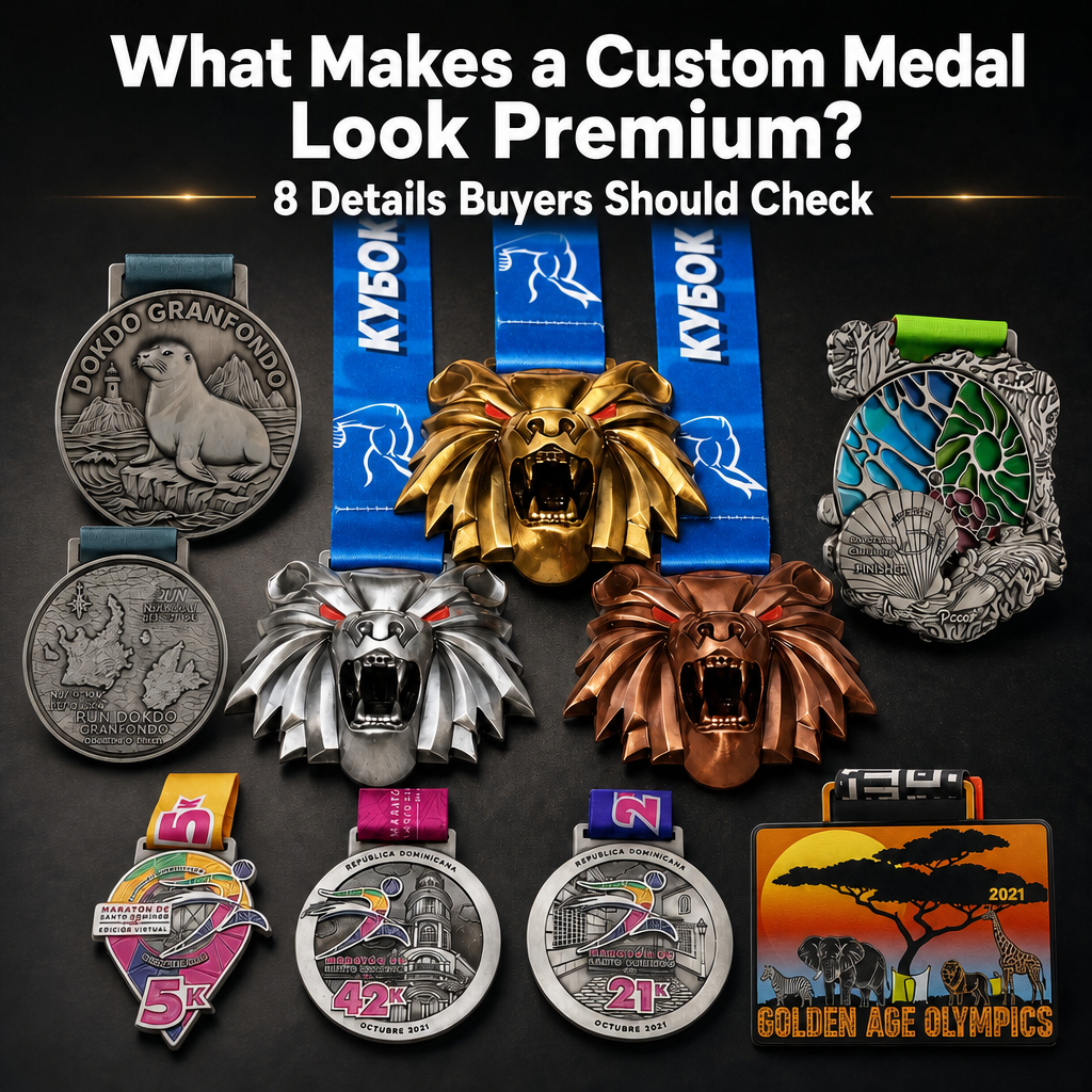
Premium Is More Than a Shiny Surface
When buyers evaluate a custom medal, the first thing they usually notice is the overall appearance: the metal finish, the colors, the shape and the size. But a truly premium medal is not created by plating alone.
A high-quality award feels intentional from every angle. The silhouette is clean. The relief has depth. The colors are controlled. The small text is readable. The back is not forgotten. The ribbon and attachment hardware match the medal's size and purpose.
These details matter because a custom medal is not only handed out at an event. It is photographed, worn, displayed and kept as a reminder of achievement. Before approving your next medal order, check the following eight points.
1. Clean Edges and a Precise Silhouette
The outline is the first quality signal. Whether the medal is circular, shield-shaped, cut-out or built with decorative extensions, the edge should look intentional and well-defined.
Look for:
- Smooth outer edges without rough flashing
- Clean corners on custom die-cut sections
- Consistent border thickness
- Strong connections around the hanger and cut-out areas
- A silhouette that supports the event theme rather than distracting from it
Complex shapes require more than an attractive drawing. They must also remain structurally stable after casting, trimming and finishing. A premium design balances visual originality with a practical metal structure.
2. Clear 3D Relief and Layered Depth
A premium medal should not look like a flat image attached to a metal disc. Strong relief creates visual hierarchy: some elements stand forward, others sit deeper, and the finish catches light across different planes.
Lion-Head Medal Set: Relief That Defines the Product
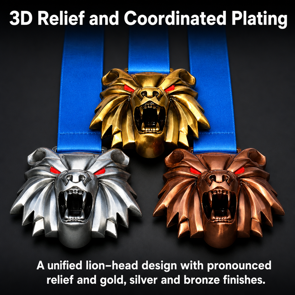
The lion-head set demonstrates pronounced sculpted relief: the face, mane, mouth and surrounding decorative forms project at different depths. Repeating the same 3D design in gold, silver and bronze creates a coordinated podium family while allowing each award level to remain visually distinct.
When reviewing a 3D medal proof, pay attention to the main focal point first. The face, athlete, building, vehicle or emblem should have enough height and separation to remain recognizable under normal lighting. Too little depth makes the design appear flat; too much depth can create fragile edges or difficult plating areas.
3. Consistent Plating and Metal Finish
Gold, silver, bronze, antique silver and darker finishes all create different visual impressions. What makes a plating finish look premium is not simply its color, but its consistency across the whole medal.
Check whether:
- The raised and recessed areas have a clear contrast
- The finish is even across large surfaces
- Decorative edges do not show unwanted color variation
- The metal highlights support the relief instead of hiding it
- Gold, silver and bronze versions still look like one unified medal series
For a podium set, the mold and relief should remain visually consistent while the plating changes clearly distinguish first, second and third place. This gives the award system a professional sense of order.
4. Complex Artwork Must Remain Clear
Some medals use a simple logo and a few color blocks. Others combine buildings, animals, waves, maps, landscape scenes, sports figures and event lettering. Complex artwork can look premium only when the details remain readable after being transferred to metal.
The important question is not how many elements can be placed on the artwork. It is whether the final medal still has a clear visual hierarchy.
The main subject should be easy to identify. Secondary details should support the story without creating visual noise. Fine lines, small facial features, architectural windows and natural textures need enough separation to survive the production process.
5. Front-and-Back Design Should Feel Complete
One common mistake is to invest heavily in the front and leave the reverse side blank or generic. For a keepsake medal, the back is another opportunity to carry information that matters to the participant.
Possible back-side content includes:
- A route map
- Coordinates or location information
- Event date and distance
- Sponsor or organizer identity
- A short achievement message
- A secondary version of the event logo
- A textured pattern related to the front design
Front and Back: Dokdo Gran Fondo
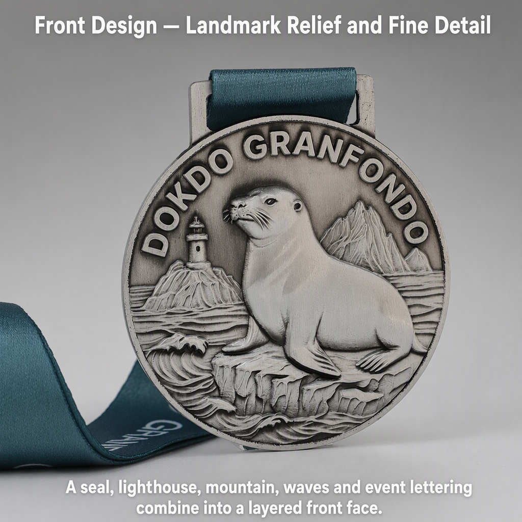
The front face combines event lettering, a seal, lighthouse, mountain, waves and a seated animal figure in layered relief. The design shows how a detailed landmark and natural scene can share one medal face without losing the central subject.
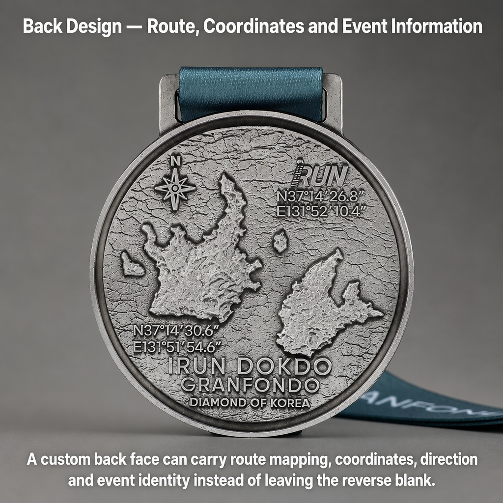
The reverse side uses a map-like layout with a direction mark, route information, coordinates and event text. Instead of treating the back as empty metal, the design turns it into an additional information surface for the participant.
A well-designed front-and-back medal feels more complete in the hand. It gives the runner, athlete or participant something new to discover when the medal is turned over.
6. Cut-Out Structures Must Be Both Creative and Strong
An open or cut-out medal can create a premium visual effect because the background becomes part of the design. It can also reduce visual weight and make the medal feel more sculptural.
However, cut-out structures require careful engineering. Thin bridges, narrow corners and small attachment points must be strong enough for handling and wearing. The open area should be intentional rather than simply removing metal from an overcrowded design.
Adventure Medal: Cut-Out and Mixed Detail
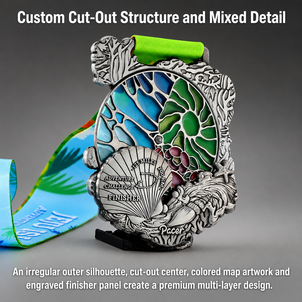
This adventure medal combines an irregular outer silhouette, open structure, full-color map artwork, natural forms and an engraved finisher panel. The contrast between colored areas and silver relief makes the medal feel layered and dimensional from multiple viewing angles.
Before approving a cut-out medal, ask the manufacturer to review the 3D structure and the narrowest metal connections. A premium appearance should not come at the expense of durability.
7. Series Consistency Across Different Awards
A premium medal series looks organized when different distances, categories or award levels clearly belong together.
The same visual language can be maintained through:
- A shared outer shape
- Consistent border treatment
- Repeated typography
- Similar ribbon construction
- A common plating system
- A unified color palette
At the same time, each medal should remain easy to identify. Distance numbers, event names, color accents or landmark scenes can separate the versions without breaking the overall family.
Santo Domingo 5K, 10K and 21K Series
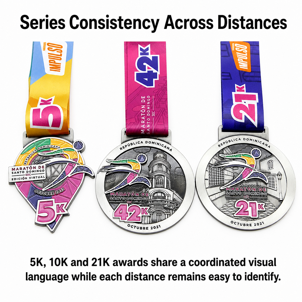
The Santo Domingo series uses coordinated circular medal structures, shared event branding and related city imagery for the 5K, 10K and 21K distances. Different colors, distance numbers and ribbon treatments help participants identify each race while preserving a unified event family.
This approach is useful for race organizers who offer several distances on the same event weekend. Participants can immediately understand that the medals belong to one race system, while each distance still has its own identity.
8. Ribbon, Hanger and Attachment Hardware
The medal body receives most of the design attention, but the ribbon and hanger are part of the participant's first experience. A heavy or large medal needs an attachment system that feels secure and proportional.
Check:
- Ribbon width and weave quality
- Whether the ribbon carries clear event branding
- The relationship between ribbon color and medal finish
- Hanging-hole style
- Hanger, ring, clasp and connector quality
- Whether the attachment method matches the medal's weight
- Whether a detachable charm or special connector is required
Multiple Attachment Options
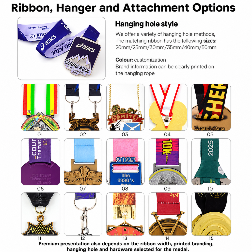
A range of ribbon widths, printed branding options, hanging-hole styles, clasps, rings, chains and decorative connectors. The attachment system can be treated as part of the medal design rather than an afterthought.
A premium medal should feel complete when it is lifted, worn and photographed. The ribbon should not look like a generic substitute for the medal's design, and the connector should not appear too weak or too small for the medal body.
A Practical Buyer Checklist
Before you approve a custom medal, ask the manufacturer to confirm these points:
Product Structure
- Is the outer silhouette clean and structurally sound?
- Does the 3D relief have enough depth to show the main design?
- Are cut-out bridges and hanger connections strong enough?
Surface and Color
- Is the plating finish consistent?
- Are recessed and raised areas clearly separated?
- Are color boundaries, printed artwork or gradients clean?
Information and Artwork
- Is every word, date, distance and coordinate correct?
- Does the back carry useful custom information?
- Are the smallest text and design details readable at the final size?
Series and Accessories
- Do different award levels look like one coordinated system?
- Is the ribbon width appropriate for the medal?
- Do the hanger, ring and clasp match the medal's size and weight?
Requesting a 2D proof, a 3D rendering and a pre-production sample is one of the safest ways to catch problems before mass production.
Final Thought
A premium custom medal is the result of many controlled details working together. It is not only a shiny surface or a large size. It is the combination of a clean silhouette, visible relief, consistent plating, accurate artwork, complete front-and-back design, reliable structure, series consistency and a well-matched ribbon system.
When buyers check these details before ordering, they are more likely to receive a medal that looks impressive at the award ceremony and remains valuable as a keepsake long afterward.
Zhongshan Wotid Hardware Co., Ltd. creates custom event medals with personalized shapes, relief, plating, color, ribbons and attachment systems. Send us your artwork, event information or design idea, and we can help recommend a production direction for your project.
Table of Contents
- Premium Is More Than a Shiny Surface
- 1. Clean Edges and a Precise Silhouette
- 2. Clear 3D Relief and Layered Depth
- 3. Consistent Plating and Metal Finish
- 4. Complex Artwork Must Remain Clear
- 5. Front-and-Back Design Should Feel Complete
- 6. Cut-Out Structures Must Be Both Creative and Strong
- 7. Series Consistency Across Different Awards
- 8. Ribbon, Hanger and Attachment Hardware
- A Practical Buyer Checklist
- Final Thought