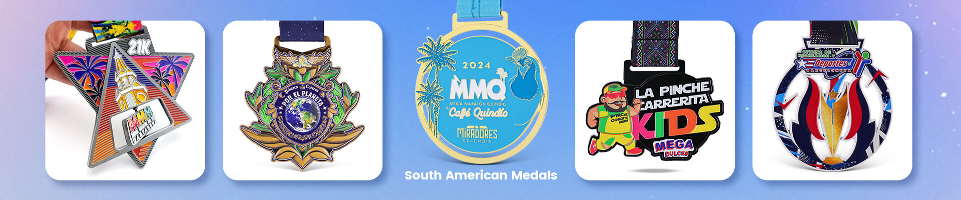
Introduction: Design for Manufacturing (DFM)
A great event starts with a great medal. However, many designers create beautiful digital mockups that are nearly impossible to replicate perfectly in metal. In B2B manufacturing, this is called a lack of DFM (Design for Manufacturing).
At Zhongshan Wotid Hardware Co., Ltd., we’ve handled thousands of international orders. To help you save time, reduce costs, and ensure your medals look exactly as envisioned, here are the 5 most common design pitfalls—and how to avoid them.
Mistake 1: Lines That Are Too Thin
In digital design, a 0.1mm line looks sharp. In zinc alloy casting, it can be a disaster.
-
The Technical Risk: Molten metal needs space to flow. Lines that are too thin may not fill properly in the mold, or they might break during the polishing phase.
-
Wotid’s Advice: Keep your minimum raised metal line at 0.2mm - 0.3mm. This ensures every detail of your logo is crisp and structurally sound.
Mistake 2: Forgetting the Metal Borders for Enamel
Soft enamel and hard enamel are liquid paints poured into recessed areas.
-
The Technical Risk: Without a raised metal border to "trap" the liquid, colors will bleed into each other.
-
Wotid’s Advice: Always ensure there is a distinct metal wall (border) between two different colors. If your design requires a "borderless" gradient, we suggest UV Printing as an alternative.
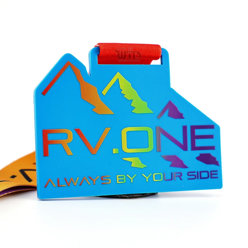
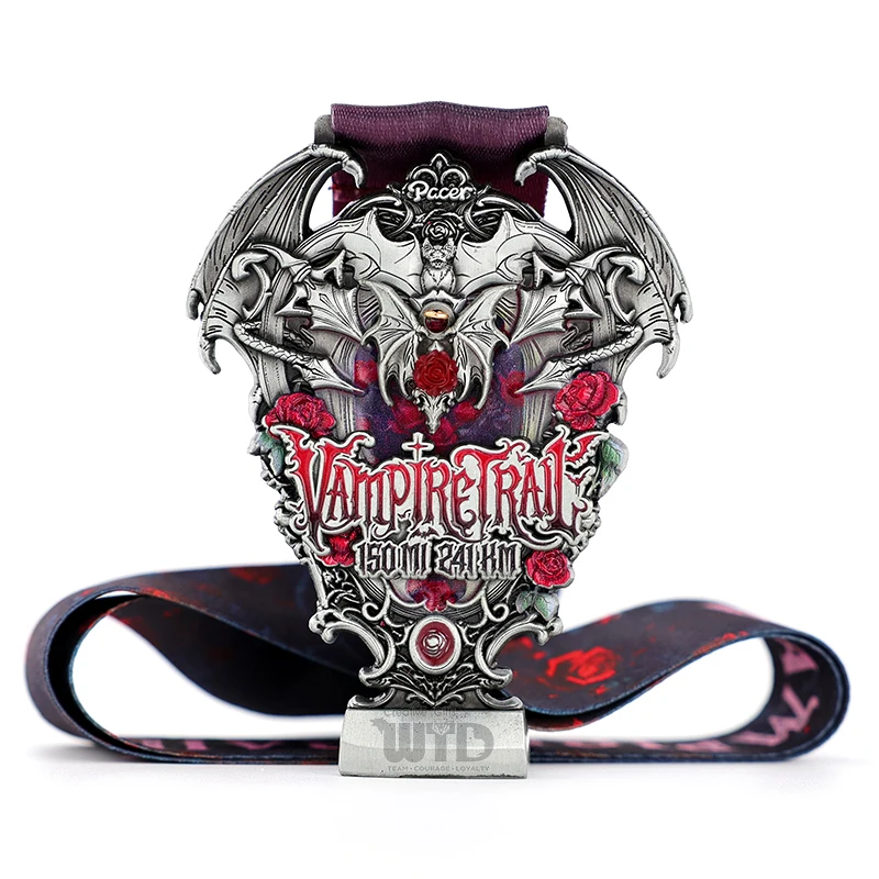
Mistake 3: Neglecting 3D Relief Depth
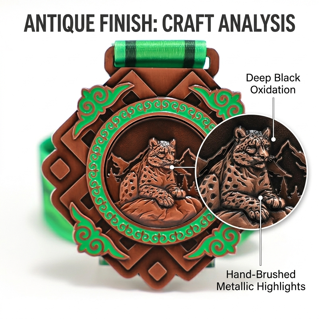
"Example of perfect 3D level planning for high-contrast relief."
Many designers treat a 3D medal like a 2D drawing, ignoring the Y-axis.
-
The Technical Risk: If the 3D relief is too flat, the medal lacks "gravity" and premium feel. If it's too deep, it may cause air bubbles during casting.
-
Wotid’s Advice: Utilize our 0.05mm precision CNC technology. Plan your design in 3-4 distinct levels of height (Level 1 for background, Level 4 for the main logo). This creates the "depth" that makes participants say "Wow."
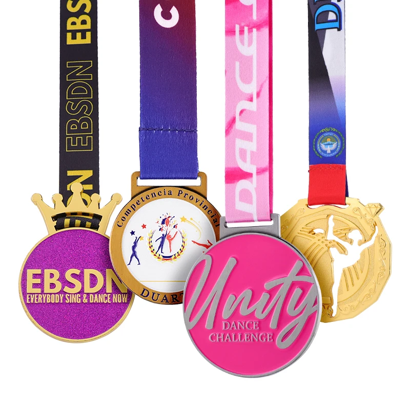
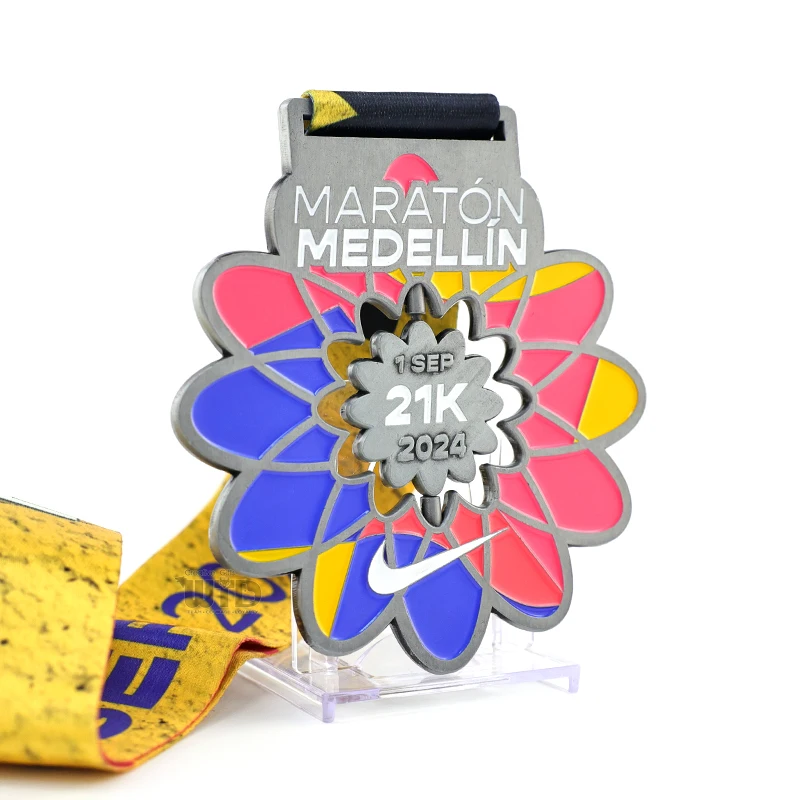
Mistake 4: Overly Complex Typography
Small, serif fonts (like Times New Roman) with thin tails often fail in metal.
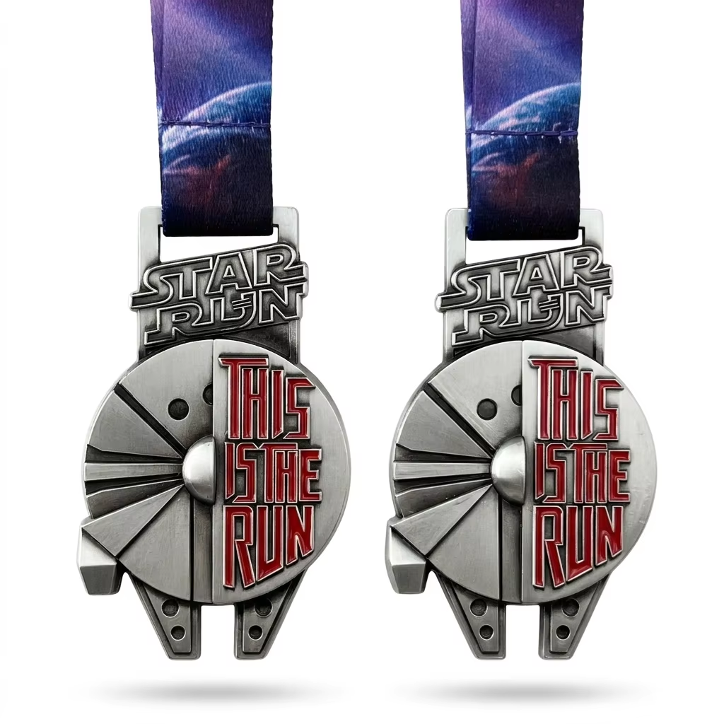
"Notice the crisp, readable text even with complex mechanical designs."
-
The Technical Risk: Tiny gaps in letters like "e", "a", or "o" can get clogged with plating material, making the text unreadable.
-
Wotid’s Advice: Use Sans-Serif fonts (like Arial or Helvetica) for small text. Ensure the "internal hole" of any letter is at least 0.3mm wide.
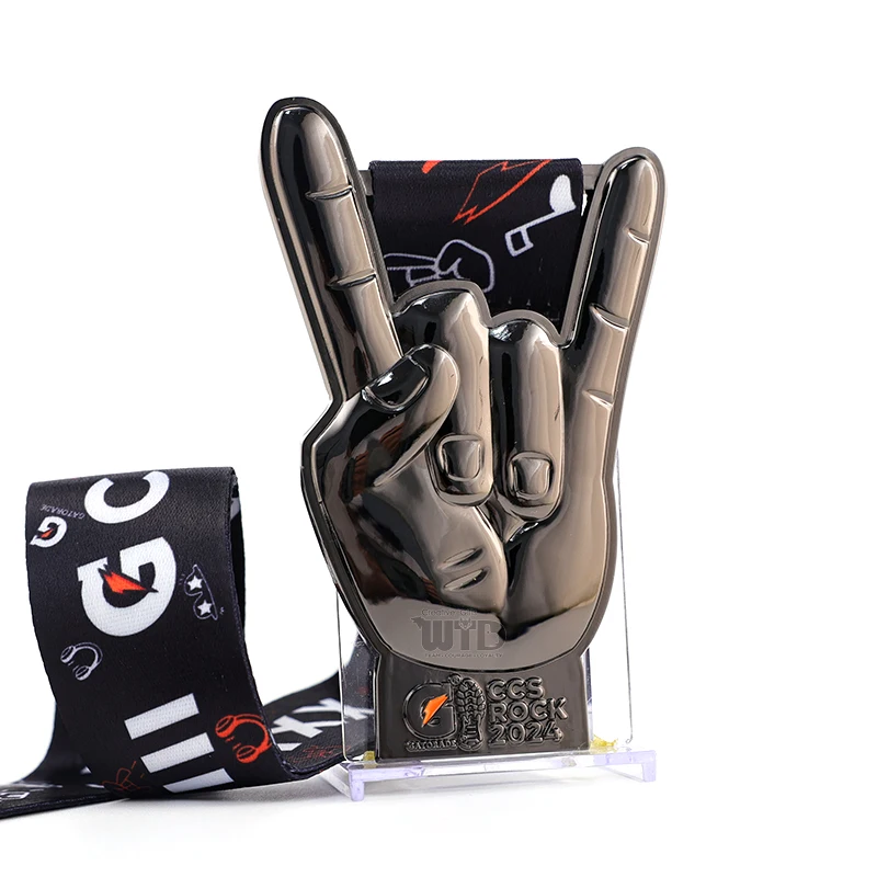
Mistake 5: Poor Weight and Ribbon Slot Balance
A heavy 80mm medal needs a slot that can handle the torque.
-
The Technical Risk: If the ribbon slot is too thin or the medal is too top-heavy, it will hang awkwardly on the athlete’s chest, tilting forward.
-
Wotid’s Advice: For medals over 100g, we recommend a V-shape hanging attachment or a reinforced ribbon slot. Let our engineering team simulate the "gravity center" before we open the mold.
Conclusion: Let’s Refine Your Vision
You don't need to be a manufacturing expert—that’s our job. At Wotid, our in-house design team reviews every artwork to ensure it's "Mold-Ready." We turn your sketches into masterpieces without the guesswork.
Ready to start your next project? [Contact Wotid Hardware for a Free Artwork Audit]
 Hot News