 EN
EN
One Running Event Can Tell Many Different Stories
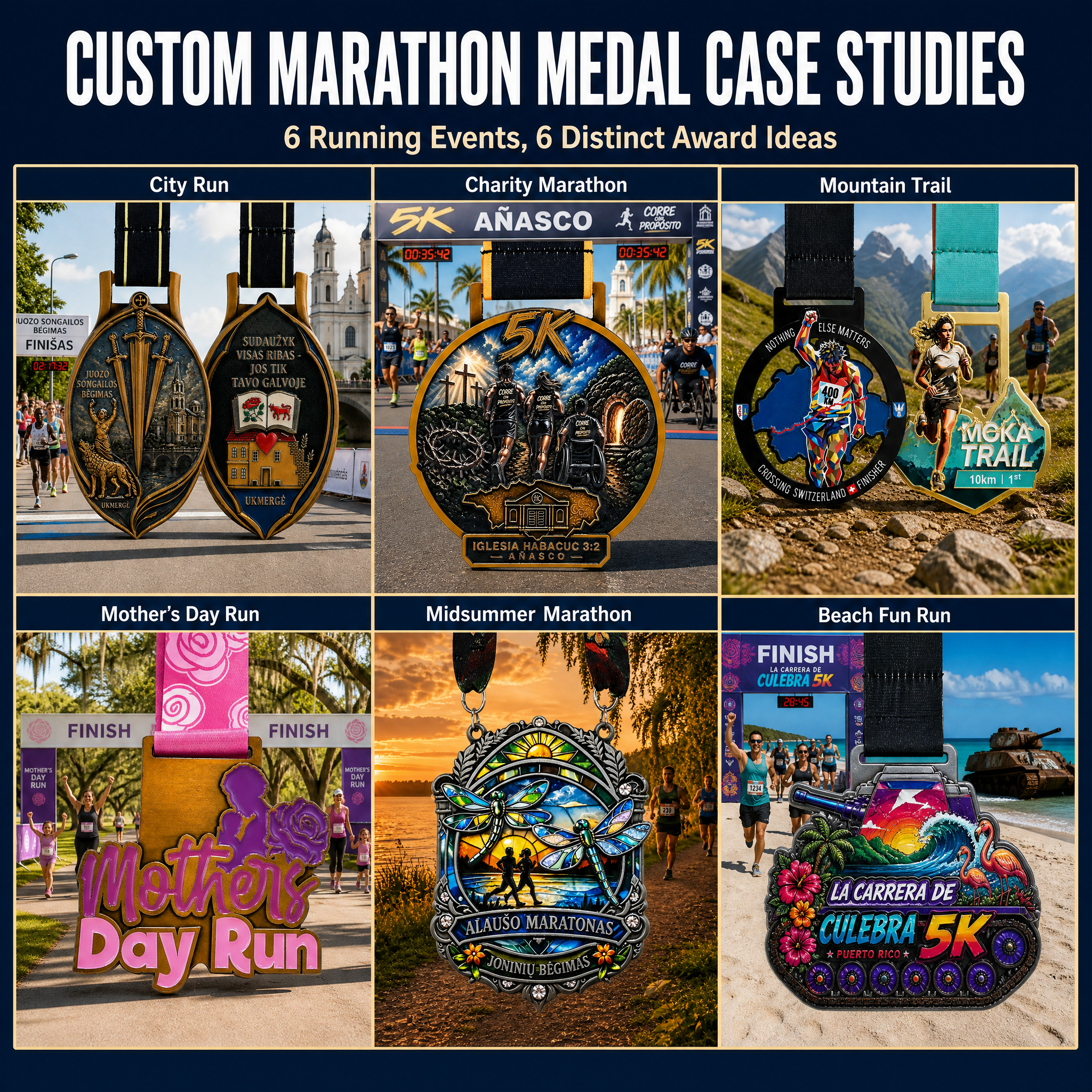
A running medal is more than a record of participation. It can capture the place where the event happened, the reason people joined, the terrain they crossed or the season that gave the race its personality.
That is why a city road run, a charity marathon, a mountain trail race and a themed fun run should not all use the same visual language. The event type gives the medal its starting point. The design then turns that event identity into a wearable award.
This article presents six custom marathon and running medal case studies. Each case focuses on a different design direction:
- City identity and local landmarks
- Purpose-driven charity participation
- Mountain terrain and endurance
- Family and seasonal celebration
- Summer atmosphere and natural scenery
- Coastal color, culture and fun
The examples are design references rather than one fixed formula. When planning a new medal, organizers can choose the visual ideas that best match their own event.
Case Study 1: City Run Medal With Local Identity
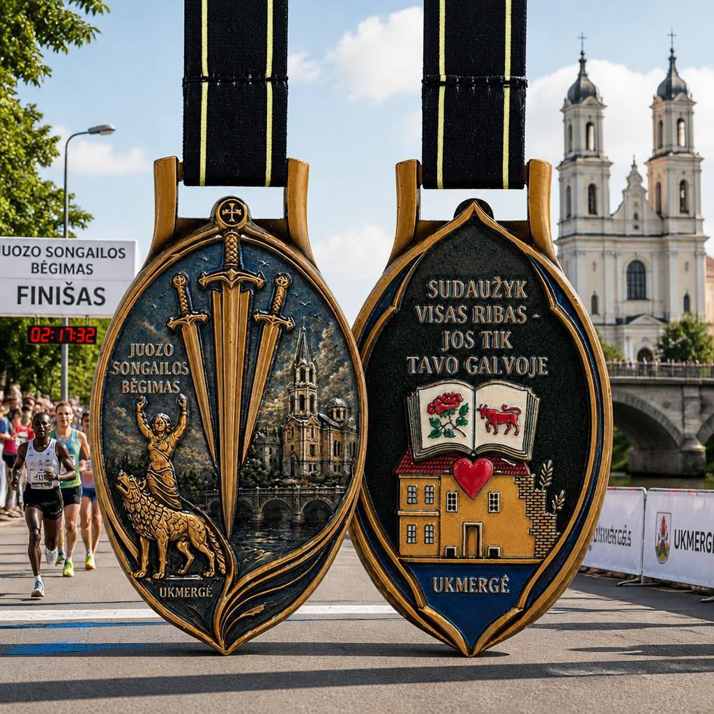
A city road-run medal uses architectural and local visual references to connect the finisher award with the event location.
A city run gives designers an opportunity to make the destination part of the award. In this example, the medal is shown against an urban race scene with a prominent church-like landmark, runners and a finish-time display. The medal itself uses a tall, shield-like outline and carries architectural, symbolic and local graphic details across its two visible sides.
What Makes This Direction Effective?
The medal does not rely only on a generic runner icon. It creates a stronger sense of place by combining:
- A recognizable local building or landmark
- Symbols connected with the city or community
- Event wording and location information
- A distinctive outer silhouette
- A coordinated ribbon and hanger
This approach is useful when participants travel to the event or when the organizer wants the medal to remain a souvenir of the destination.
Design Lesson for Organizers
Start by identifying the one or two visual references that people immediately associate with the city. A landmark, bridge, skyline, historic building or local symbol can create a stronger memory than a crowded collection of unrelated decorations.
The goal is not to place every city feature on the medal. It is to select the elements that make the location recognizable at a glance.
Case Study 2: Charity Marathon Medal With a Shared Purpose
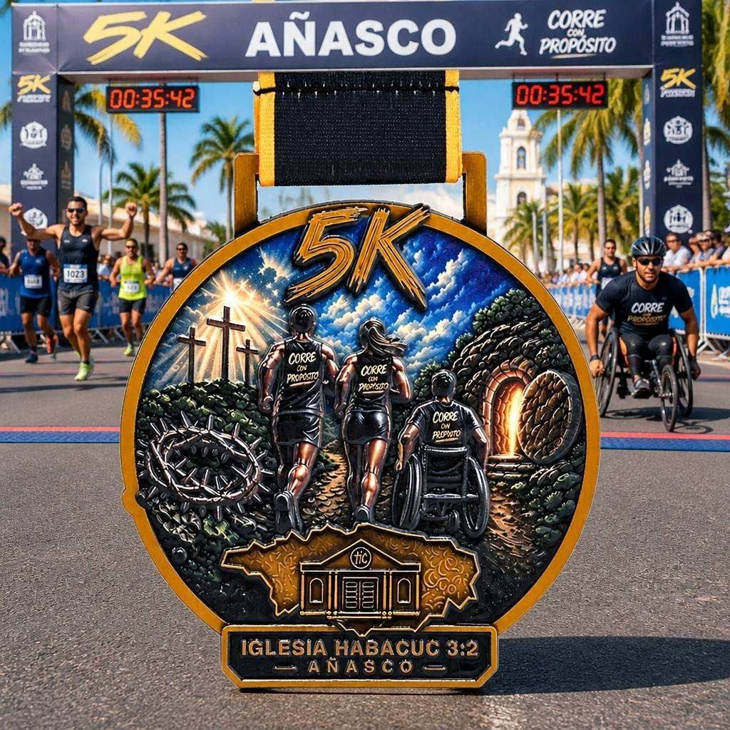
A charity-focused 5K medal uses participant imagery, a strong event mark and purpose-led visual storytelling.
The second example is a charity-oriented 5K event medal. Its visual presentation includes the event name, a prominent distance mark, runners moving together and a scene that connects participation with a shared purpose. The race backdrop also communicates a community event rather than an individual competition alone.
What Should a Charity Medal Communicate?
A charity medal can recognize both physical achievement and collective participation. Its design may emphasize:
- The cause or organization behind the event
- The distance completed
- A group of participants rather than a single winner
- Shared movement and inclusion
- A clear event name that supporters can remember
The supplied example includes several participants in the medal artwork, including a wheelchair user. That visible inclusion changes the story of the award: it presents the event as a community effort rather than a narrow performance image.
Design Lesson for Organizers
Decide whether the medal’s main message is the cause, the community or the athletic challenge. These elements can work together, but one should lead the visual hierarchy. A strong charity medal allows participants to feel connected to the purpose they supported.
Text should also be reviewed carefully. The event name, distance and organization details need to remain readable without overwhelming the central story.
Case Study 3: Mountain Trail Medal Built Around Terrain
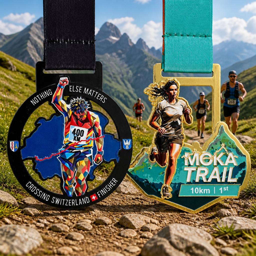
Two mountain-trail medal directions use elevation, runners, open spaces and rugged landscape imagery to express outdoor endurance.
A mountain trail race has a different visual vocabulary from a city road run. The terrain is not merely a background; it is part of the challenge that participants remember.
The supplied trail examples show two different approaches. One places a colorful runner figure over a map-like field inside an open circular structure. The other combines a runner, mountain imagery and a bold geographic outline. Both designs connect the award with distance, elevation and outdoor effort.
Useful Trail-Medal Elements
A trail medal may use:
- Mountain peaks or contour-like landscape forms
- A route or geographic outline
- A runner in an active climbing or trail position
- Open or irregular shapes that suggest the outdoors
- Strong terrain colors such as green, blue, black or earth tones
- Distance or finisher information
The exact combination should depend on the race identity. A short scenic trail and a demanding mountain challenge do not necessarily need the same visual intensity.
Design Lesson for Organizers
Use the terrain as a design system. If the route is the main memory of the event, let the map, mountain or elevation idea guide the outline and composition. Avoid adding scenery only as decoration; each landscape element should help explain where the participant ran.
A trail medal also needs to remain readable after the design becomes three-dimensional. Irregular outlines and open areas should be reviewed carefully so that the medal retains its intended silhouette.
Case Study 4: Mother’s Day Run Medal With a Family Message

A Mother’s Day run medal uses floral symbols, pink and purple colors and a large celebratory message to make the occasion immediately recognizable.
A seasonal or family-focused run does not need to look like a standard race medal. The Mother’s Day example uses a large celebratory phrase, a mother-and-child silhouette, roses and a pink-and-purple palette. The finish-line setting reinforces the event’s family and celebration theme.
How Does a Themed Run Become Recognizable?
The design works because several choices point in the same direction:
- The wording identifies the occasion
- The mother-and-child image creates an emotional focal point
- Floral details reinforce the theme
- Pink and purple create a distinct seasonal palette
- The oversized lettering makes the message visible from a distance
The result is less about a generic athletic achievement and more about the relationship and occasion being celebrated.
Design Lesson for Organizers
For a themed run, the theme should be visible before the viewer reads every line of text. Use one central symbol, one supporting pattern and a controlled color direction. This makes the medal easier to recognize in event photographs and social posts.
If the medal uses large lettering, check how the phrase interacts with the outer silhouette and the ribbon connection. The visual message should be strong without creating an overly fragile or crowded outline.
Case Study 5: Midsummer Marathon Medal Inspired by Light and Nature
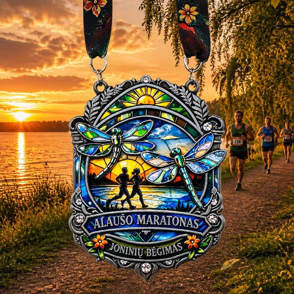
A midsummer marathon medal combines sunset light, water, flowers, dragonflies and paired runners to create a seasonal nature story.
The midsummer example takes a scenic and atmospheric approach. The medal is shown beside a sunlit waterside path, while the design includes a setting sun, water, dragonflies, flowers, foliage and two runners. Its frame and internal sections create the feeling of a keepsake rather than a simple circular badge.
Building a Seasonal Story
A midsummer event can be expressed through a combination of:
- Warm sunset colors
- Water or lakeside imagery
- Summer insects, flowers or foliage
- Paired runners or shared movement
- A framed scene that feels like a window into the event
- A ribbon that continues the seasonal palette
The key is to keep the seasonal cues connected. If the medal includes water, light and nature, the color treatment and ribbon can support the same atmosphere.
Design Lesson for Organizers
Seasonal design is strongest when it creates a mood rather than simply adding a holiday word. Consider what participants remember: evening light, warm weather, a scenic route, flowers, water or running with friends. Those memories can guide the medal’s composition.
At the same time, the event name and distance should remain readable. A decorative scene should support the race identity, not hide it.
Case Study 6: Beach Fun Run Medal With Coastal Energy
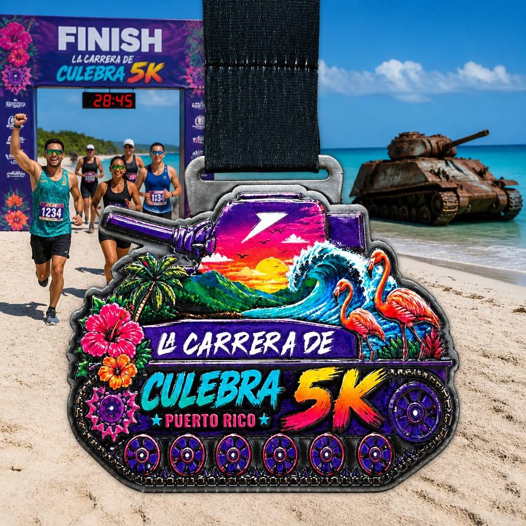
A coastal 5K medal uses bright tropical colors, waves, flamingos, flowers and local visual references to create a playful beach-event souvenir.
The beach fun-run example uses an immediately recognizable coastal palette. The medal combines waves, palm trees, flamingos, flowers, a colorful sunset and a bold 5K event message. The scene also includes runners and a beach setting, while the medal’s lower section uses repeated circular details to add rhythm to the outline.
What Makes a Fun-Run Medal Feel Playful?
A fun-run medal can move beyond formal championship styling by using:
- Bright, high-contrast colors
- Tropical or coastal wildlife
- Waves, flowers and palm imagery
- Large, expressive event lettering
- A distinctive silhouette connected with the theme
- A ribbon that supports the same visual energy
These choices make the medal attractive in finish-line photos and easy for participants to identify later.
Design Lesson for Organizers
A playful medal still needs a clear hierarchy. Choose the event name and distance as the primary information, then use the coastal elements to build atmosphere around them. Too many small illustrations can reduce readability once the medal is produced at its final size.
For a location-based fun run, local symbols can make the award more memorable. The visual references should be checked for accuracy and used consistently across the medal, ribbon and event materials.
What These Six Cases Have in Common
Although the six events use different themes, their medal concepts follow several shared principles.
1. The Event Type Leads the Design
A city event begins with place. A charity event begins with purpose. A mountain race begins with terrain. A themed run begins with its occasion or atmosphere.
2. One Main Story Is Easier to Remember
A medal can contain multiple details, but the viewer should still understand its main story quickly. The strongest designs usually have one dominant subject supported by a limited number of secondary elements.
3. The Ribbon Is Part of the Event Identity
The ribbon appears whenever the medal is worn or photographed. Its color, pattern and attachment should support the medal rather than look like a separate item.
4. Text Needs a Planned Place
Event names, distances, dates and locations should be planned before decorative details fill the available area. Readability is part of the design, not a final correction.
5. A Memorable Shape Can Strengthen the Souvenir
A shield, map outline, open frame, large wordmark or scenic border can make a medal more distinctive. The shape should still be reviewed for practical connections and a stable final structure.
6. The Design Must Work as a Physical Award
A concept may look strong in a digital image but still require a 3D review. Relief, open sections, borders, lettering, hanging points and color areas all need to be evaluated before production.
How to Choose a Direction for Your Own Running Event
Start with three questions:
What Will Participants Remember?
Will they remember the city, the cause, the mountain route, the family occasion, the season or the beach atmosphere? That memory should guide the central visual idea.
Who Is the Medal For?
A competitive race, a community run and a family fun run may need different tones. The medal should make sense to the people who will wear it and keep it.
What Information Must Remain Visible?
Confirm the event name, distance, date, location, category and organization details before the artwork is finalized. This prevents the theme from taking over the information space.
Once the direction is clear, the design can be developed through 2D artwork, 3D structure review and finished-product confirmation.
Final Thoughts
These six case studies show that custom running medals do not have to follow one visual formula. A medal can be a city souvenir, a symbol of shared purpose, a record of mountain endurance, a family celebration, a seasonal keepsake or a colorful coastal memory.
The most effective design begins with the event itself:
Identify the story → choose the visual symbol → plan the information → review the physical structure → create the finished award.
When the medal reflects what participants actually experienced, it becomes more than a finish-line item. It becomes a lasting reminder of why they joined the run.
Zhongshan Wotid Hardware Co., Ltd. supports custom running and marathon medal projects from concept development and artwork review through 3D design and production preparation. Share your event type, theme, quantity and design direction for a practical medal-development discussion.
Table of Contents
- One Running Event Can Tell Many Different Stories
- Case Study 1: City Run Medal With Local Identity
- Case Study 2: Charity Marathon Medal With a Shared Purpose
- Case Study 3: Mountain Trail Medal Built Around Terrain
- Case Study 4: Mother’s Day Run Medal With a Family Message
- Case Study 5: Midsummer Marathon Medal Inspired by Light and Nature
- Case Study 6: Beach Fun Run Medal With Coastal Energy
- What These Six Cases Have in Common
- How to Choose a Direction for Your Own Running Event
- Final Thoughts